
Exploring Wes Anderson’s Signature Style
Wes Anderson’s directorial style is unmistakable, characterized by his use of perfectly symmetrical compositions, distinct camera maneuvers, and specific color schemes that immediately signal his authorship.
With over two decades in filmmaking, Anderson is renowned not just for his visual flair but for his unique ability to transport audiences into whimsical yet tangible universes. Whether he’s crafting entirely fictitious countries, eccentric vessels, or cities that blend past and future, every aspect is intricately detailed, from attire to the minutiae of everyday items, including the choice of fonts.
This brings us to the focus of our discussion on typography within cinema, particularly through the lens of Wes Anderson’s celebrated works.
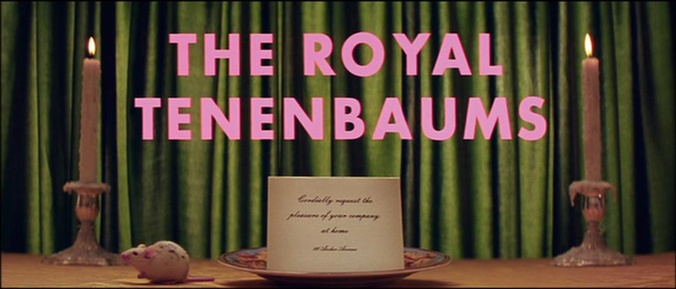
The Royal Tenenbaums
“The Royal Tenenbaums,” released in 2001, marked Anderson’s introduction to a wider audience. This narrative of a quirky family showcases all the hallmarks of Anderson’s style: vivid visual storytelling, precise composition, and dramatic zooms, not to mention his preference for a specific typeface. Indeed, Anderson’s fondness for Futura is evident, as he incorporates it throughout his films and shorts.
Futura is celebrated globally for its modern, geometric design, drawing inspiration from the Bauhaus movement without being directly affiliated. Created by Paul Renner in 1927, it was initially designed for the Neues Frankfurt project, leading to its widespread acclaim. It’s even featured on the plaque left on the moon by the Apollo 11 mission in 1969.
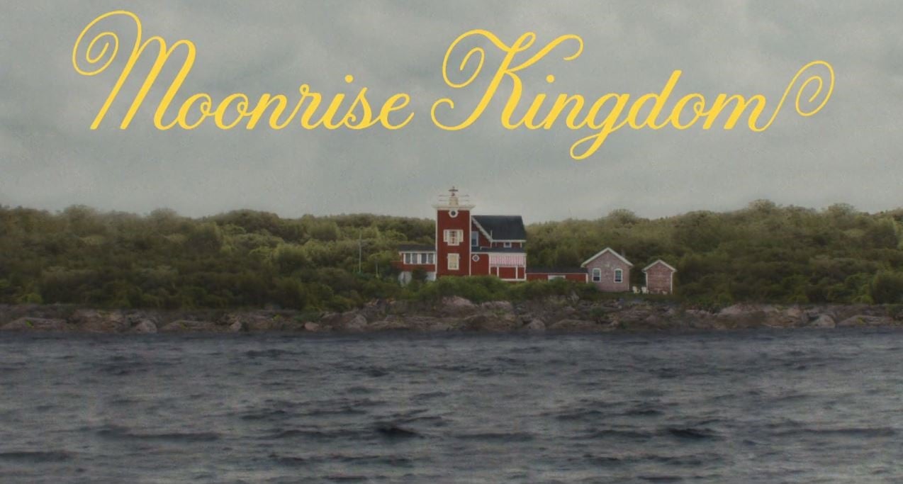
Moonrise Kingdom
A true artist knows when to evolve past their trademarks. In his seventh feature film, “Moonrise Kingdom” (2012), Anderson steps away from Futura. For this adolescent love story, he collaborates with lettering artist Jessica Hische, drawing inspiration from the titles of the 1969 film “La Femme Infidèle” by Claude Chabrol. The final design is a charming, Sixties-inspired typeface that reflects the film’s setting, achieving a perfect balance of elegance and whimsy.
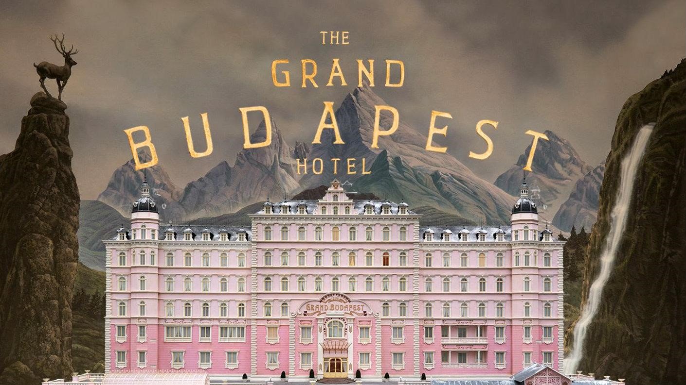
Grand Budapest Hotel
Anderson excels in creating visually rich, self-contained worlds. “The Grand Budapest Hotel” (2014) immerses viewers in the fictional Republic of Zubrowka, complete with its own cultural artifacts and typography, thanks to graphic designer Annie Atkins. This film ventures into the visual styles of Eastern Europe in the 1930s, with the hotel’s signage and the fictional newspapers contributing to the immersive experience. Here, Anderson opts for the Archer font for actor credits, diverging once more from Futura.
Isle of Dogs
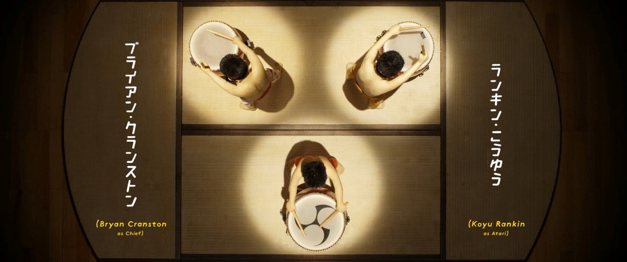
“Isle of Dogs” (2018) showcases Anderson’s second foray into stop-motion animation. Set in a dystopian Japan, the film required designer Erica Dorn to blend Western and Japanese typographic elements, creating a unique visual language for the movie’s signage and printed materials. The challenge of integrating Japanese script with Western typography underscores Anderson’s commitment to visual storytelling.
In Wes Anderson’s films, the choice of font and lettering is crucial, reflecting his deep visual literacy and meticulous attention to detail. His affinity for Futura and careful selection of typography in each project underscores the significance of fonts in cinema.
Finally, for enthusiasts, a short video tribute highlights Anderson’s typographic preferences, celebrating his contribution to cinematic art through the lens of typography.