
Before paper was invented, humans utilized various symbols in their environment to convey messages visually, essential for navigation. Over centuries, these symbols gained universally recognized meanings, a concept now encompassed by Environmental Graphic Design (EGD).
EGD is a contemporary field, having gained formal recognition in the last four decades, originally linked to architecture and known as Architectural Graphics. Professionals in this field identified significant differences from traditional graphic design, as EGD involves designing information systems for three-dimensional environments. The Society for Environmental Graphic Design (SEGD) was established in 1973 to represent this discipline.
A key area within EGD is Wayfinding Design, which encompasses guiding individuals through spaces, providing space-related information, and crafting a unique identity or ambiance for locations.
Distinctions between Signage and Wayfinding
While often used interchangeably, Signage focuses on the signs themselves, whereas Wayfinding encompasses a holistic approach to guiding individuals through spaces.
This field entails creating visual cues across various settings like airports, hotels, parks, corporate buildings, hospitals, transportation systems, and cities to aid navigation.
Practicality and Boundaries
Wayfinding Design aims to implant a spatial map within users’ minds to facilitate navigation. However, it’s acknowledged that signage alone cannot rectify the complexities of navigating through intricate spaces. While Wayfinding Design aids in orientation, it has its limitations based on the physical layout of the space.
Space Identity
In the context of increasing emphasis on branding strategies across both commercial and institutional entities, Wayfinding Design becomes a crucial touchpoint in brand interaction. Effective signage should integrate seamlessly with an organization’s broader identity elements.
There are two approaches to Signage: one that harmonizes with the space’s architectural and spatial features, and another that imposes a distinct identity irrespective of the space’s visual attributes.
Illustrative Case Studies
Exploring various Wayfinding Design projects reveals the discipline’s breadth, from the technical aspects of signage production to its implementation across different scales and contexts.
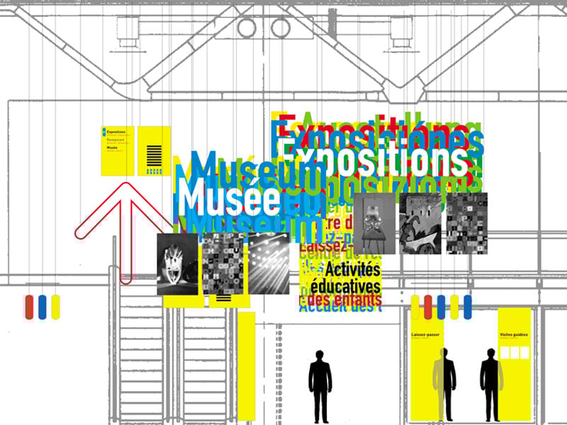
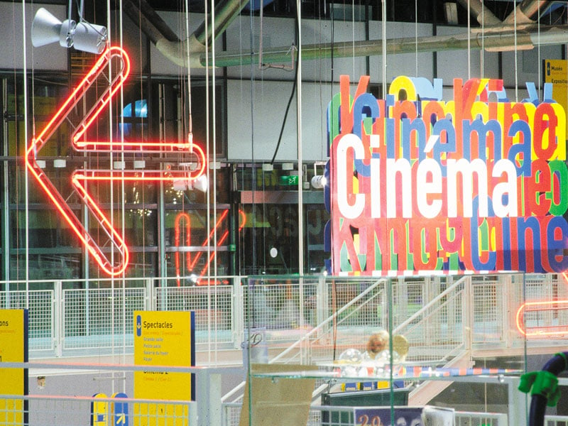
Centre Pompidou, Paris
Designer Ruedi Baur’s work at the Centre Pompidou, in collaboration with architects Renzo Piano and Richard Rogers, showcases signage designed to complement the architecture, employing a vibrant color scheme and pictograms to guide visitors.
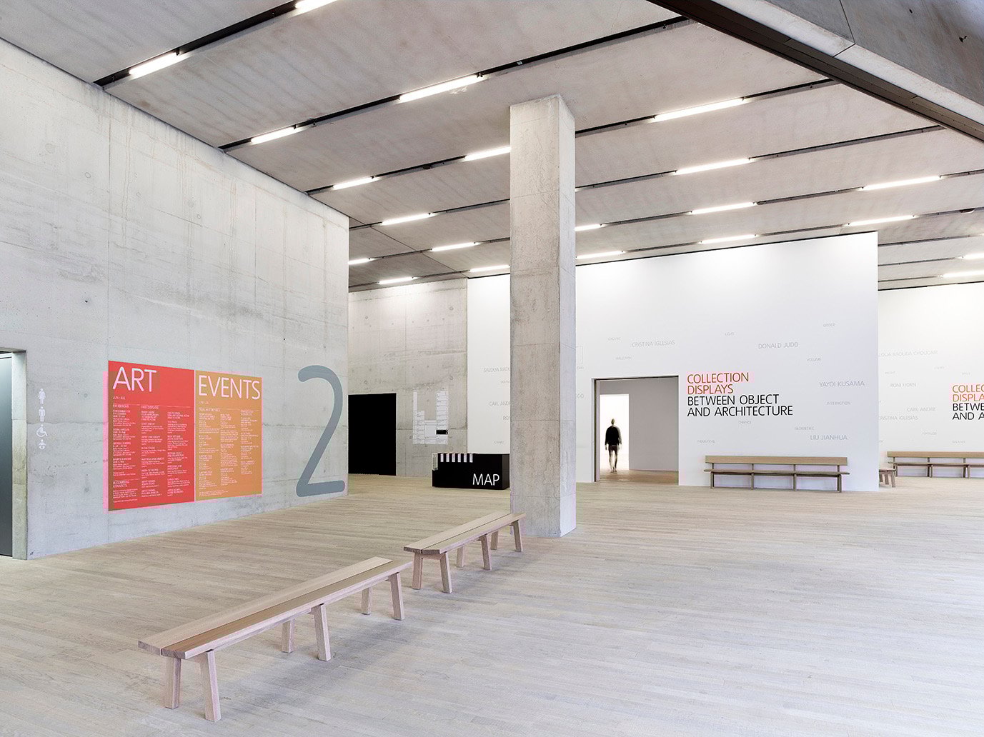
Tate Modern, London
The Wayfinding Design for Tate Modern, executed by Cartlidge Levene, focuses on guiding visitors through the gallery’s diverse spaces, employing pre-spaced vinyls on concrete walls complemented by brochures and maps.

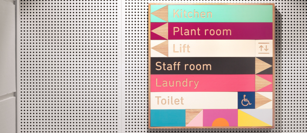
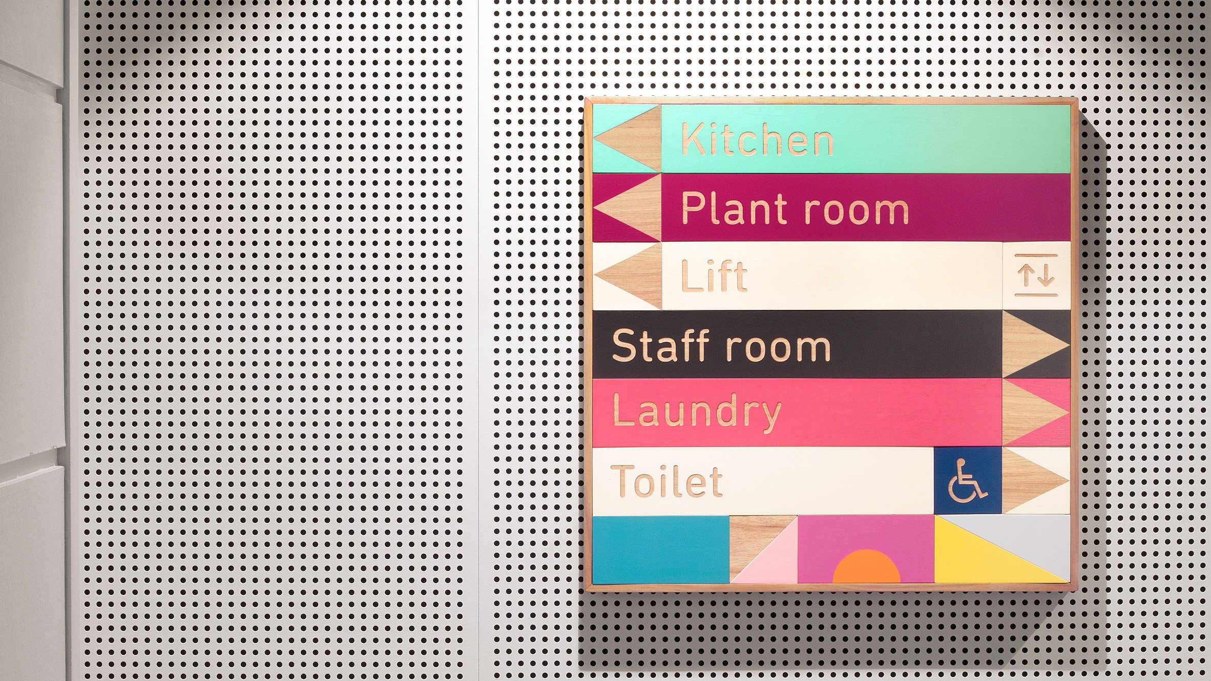
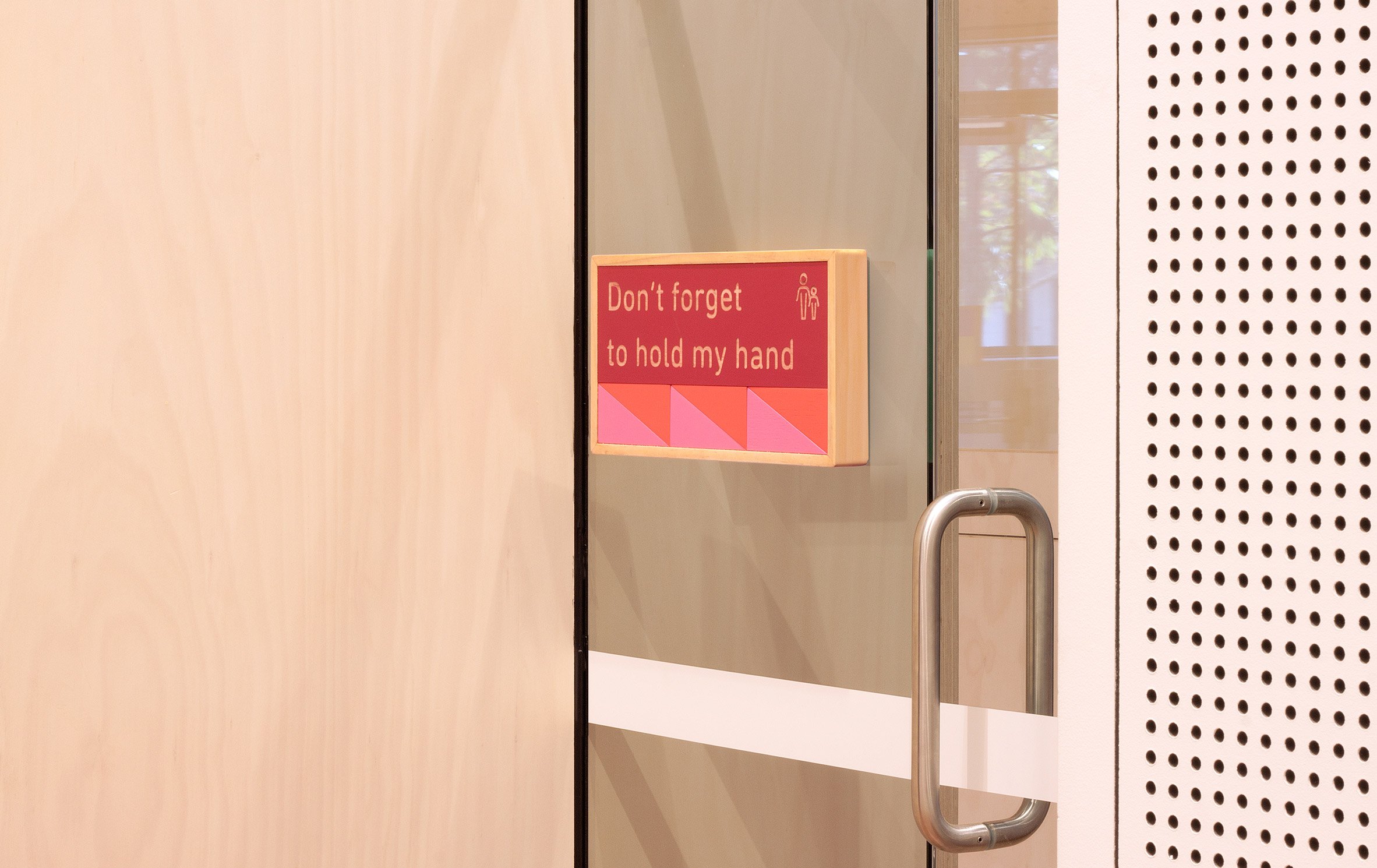
East Sydney Early Learning Centre
Toko’s design for the East Sydney Early Learning Centre draws inspiration from children’s building blocks, using a soft, varied color palette and magnetic, rearrangeable signage blocks.
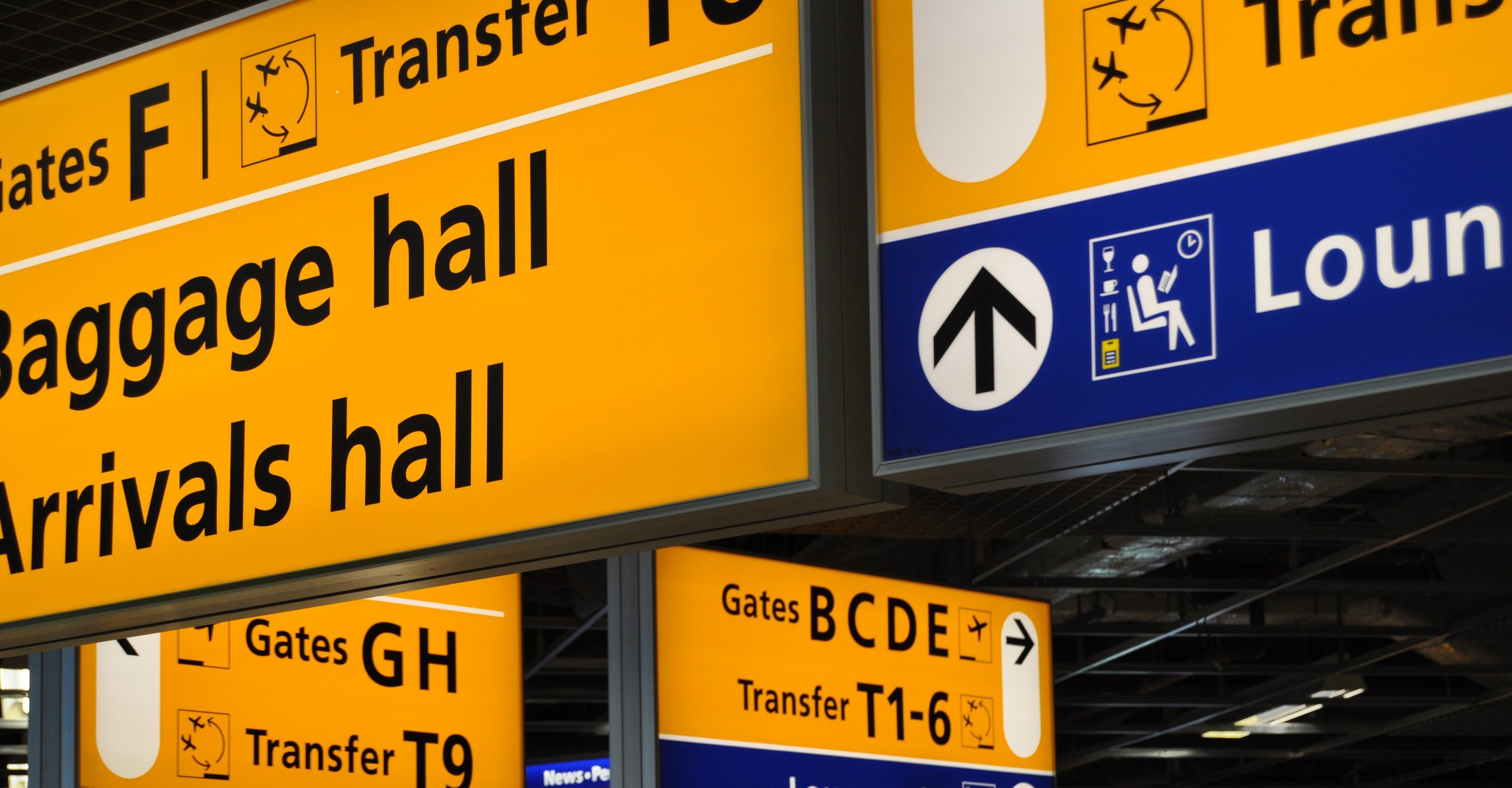
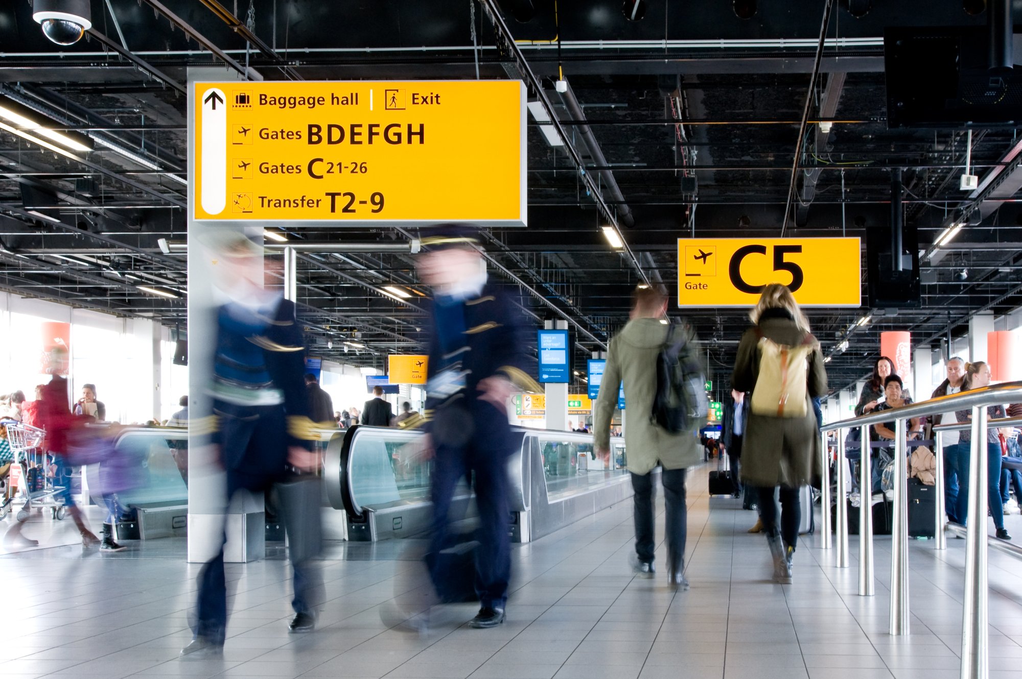
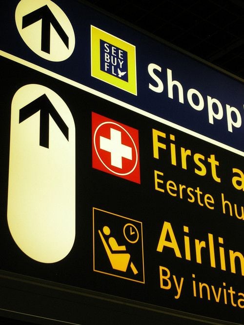
Schiphol Airport, Amsterdam
Mijksenaar’s Wayfinding Design for Schiphol Airport, characterized by the use of yellow, pictograms, and legible typography (notably Frutiger), employs large backlit signs for clarity.
Despite the digital world’s growing presence, Wayfinding Design remains a predominantly physical practice. The highlighted examples demonstrate the field’s capacity for experimentation with colors, typography, and production techniques, ensuring diverse yet effective outcomes.