
The Bauhaus school in Germany was at the forefront of exploring the fusion of artistic and design concepts, which were subsequently applied to tackle challenges in functional design and mechanized production. The students and professors of this school played a pivotal role in shaping 20th-century furniture, architecture, product design, and graphic art.
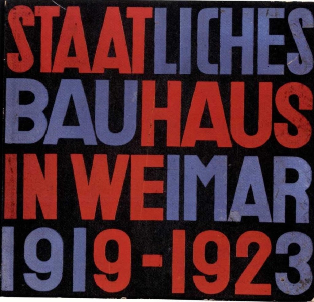
Following World War I and the establishment of the Weimar Republic, the Weimar School of Applied Arts and the Weimar Academy of Fine Arts merged in 1919 to form Das Staatliche Bauhaus, under the leadership of architect Walter Gropius. The school’s manifesto, widely propagated in German newspapers, advocated for the synthesis of art and technology to address visual design challenges brought about by industrialization. This concept was metaphorically represented as a cathedral, symbolizing the pinnacle of all visual arts. The manifesto argued that architects, painters, and sculptors needed to start anew in understanding the unified nature of a building.
The Bauhaus school operated in three different German cities: Weimar from 1919 to 1925, Dessau from 1925 to 1932, and Berlin from 1932 to 1933. The Dessau period, under Walter Gropius’s leadership, marked the peak embodiment of Bauhaus values and philosophy.
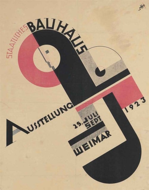
One notable figure from the Weimar Bauhaus was Herbert Bayer, who collaborated closely with his professor, Lazo Moholy-Nagy. Bayer’s early typographic work included designing the catalog cover for the school’s 1923 exhibition. When the school relocated to Dessau due to government pressures, Bayer was appointed a professor, leading to the establishment of a typography and graphic design workshop. This workshop produced printed materials for Dessau businesses, contributing to the school’s funding. Bayer’s course brought innovations in constructivist and functional design, often utilizing sans-serif fonts and experimenting with geometric, structured typographic layouts. Texts were frequently justified, creating spacing between letters or words for column filling. Enhanced contrasts in text sizes established visual hierarchies, while simple shapes like lines, bars, circles, and squares guided viewers through compositions. Bayer employed elemental forms and a limited color palette, primarily black.
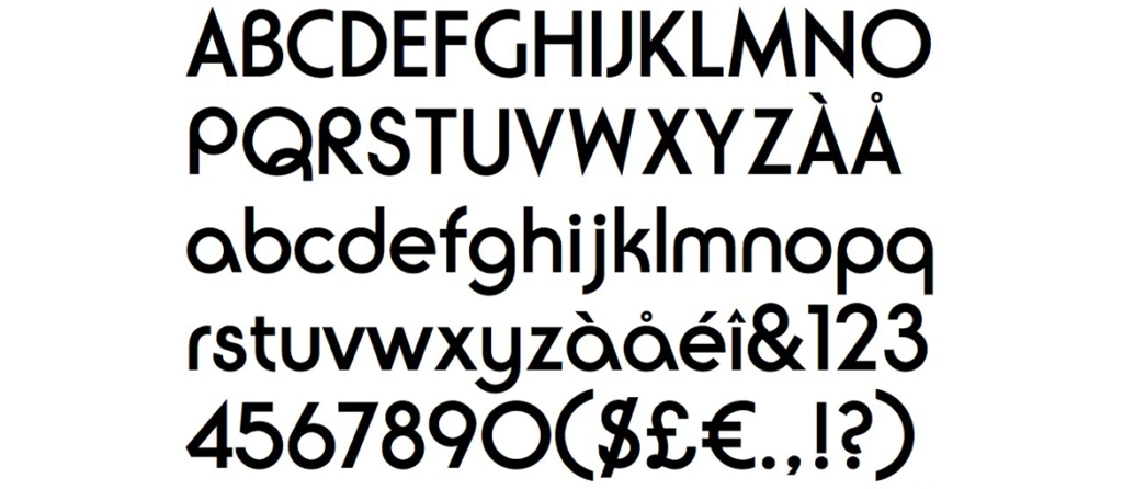
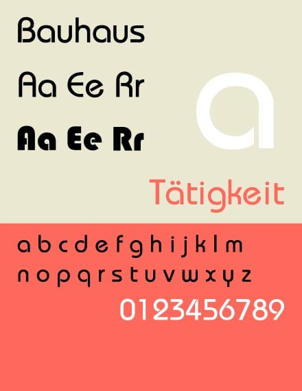
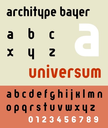
In 1925, Walter Gropius tasked Bayer with creating a typeface for all Bauhaus official communications, resulting in the development of the “Universal Character” typeface. This geometric sans-serif typeface consisted solely of lowercase letters, adhering to the “form follows function” doctrine and breaking away from traditional uppercase letters.
Although the Universal Character typeface epitomized Bauhaus typographic aesthetics, it wasn’t widely adopted. Bayer’s typographic achievements at the Bauhaus included his 1926 design of a Kandinsky exhibition poster and a 1927 applied arts exhibition poster.
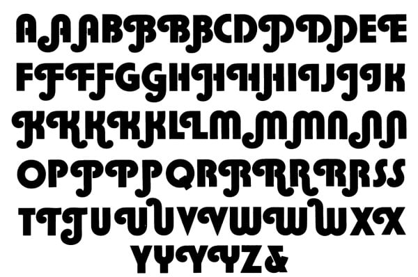
Subsequently, various designers revisited Bayer’s typeface. In 1967, David L. Burke drew inspiration from it to create Burko. In 1969, Joe Taylor developed a bold version of Burko, renaming it Blippo. In 1970, Herb Lubalin designed ITC Ronda, incorporating lowercase letters while echoing the previous fonts.
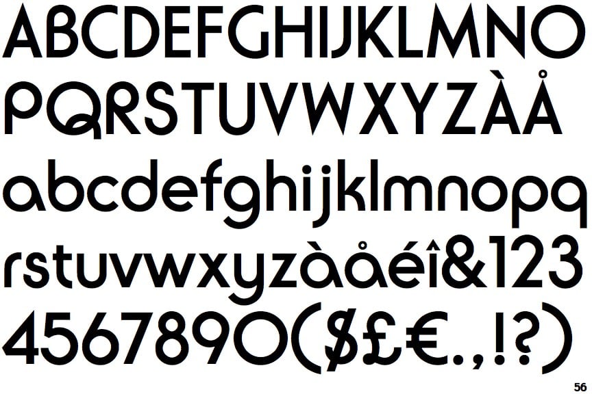
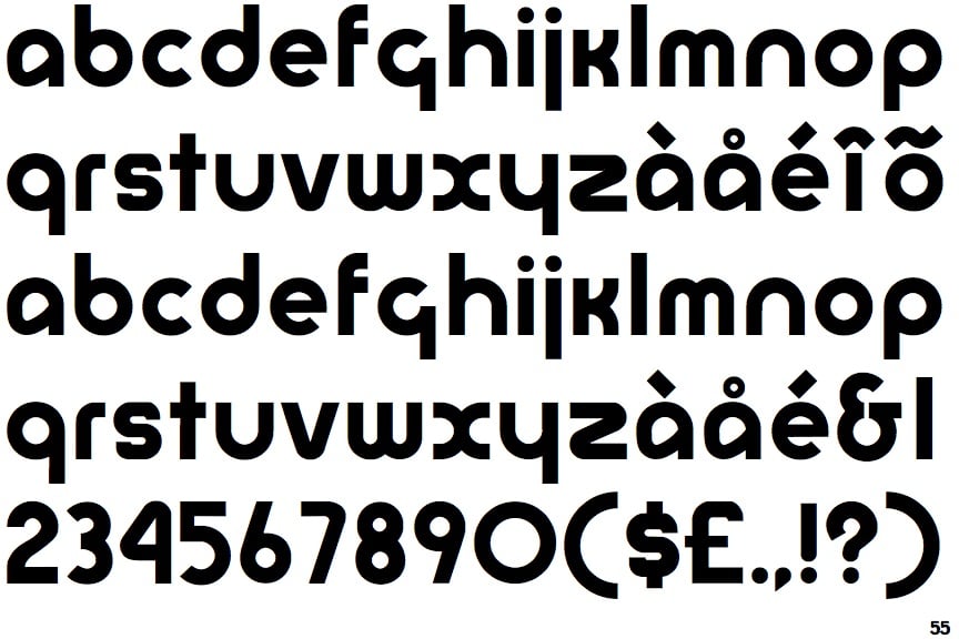
In 1975, Ed Benguiat and Victor Caruso introduced ITC Bauhaus, which closely mirrored Bayer’s geometric forms and included both uppercase and lowercase letters. The final iteration of Bayer’s typeface, Architype Bayer, was created in 1997 by Freda Sack and David Quay of The Foundry, featuring only lowercase letters.
Bayer’s innovative typography had a lasting impact on contemporary design, with subsequent fonts inspired by his work continuing to influence modern graphic design.