
Should you possess even a basic familiarity with typography, you’ll understand that font selection and text arrangement transcend mere personal preference. In crafting web content, brochures, books, business cards, posters, flyers, magazines, or any text-inclusive materials, adherence to specific typographical and graphical organization standards is crucial. Through this article, we aim to refresh these principles for you.
This article gathers several pointers, constituting our concise guide to typography. Though compact, it’s packed with valuable advice!
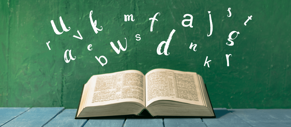
Chapter One: Fonts
Outstanding graphic designs begin with the selection of exceptional fonts that not only match the brand’s character but also blend well together. Fonts fall into two categories: serif, adorned with small projecting features called serifs, and sans serif, lacking these details and often referred to as “sticks.”
Serifs, rooted in Latin script, prevail in printed materials like books, magazines, and newspapers. This prevalence stems from serifs’ ability to condense space between letters, fostering continuity and facilitating prolonged reading on paper.
Conversely, sans serifs, emerging in the nineteenth century, are devoid of extensions and boast a more straightforward and stark appearance, enhancing legibility on digital screens or in diminutive print forms. In print, they frequently appear in annotations, captions, business documents, and children’s literature.
Font Selection and Combination
Fonts direct the reader’s journey through the page, indicating the sequence of reading. Establishing visual hierarchies involves, beyond font size, the art of font pairing. But what’s the secret to harmonizing fonts? Here are two strategies for effective font pairing.
First Approach: Utilize font families. This is the more straightforward route. Opt for a font family that encompasses both serif and sans serif variants. For instance, use serifs for titles and sans serifs for body text, creating a basic font hierarchy without clashing styles.
Second Approach: Combine distinct fonts. Here, two key guidelines are:
- Limit the project to 2-3 fonts to avoid visual chaos.
- Avoid matching similar fonts. Often, contrasting fonts complement each other better. For example, the geometrically inclined League Spartan pairs well with the elegantly traditional Libre Baskerville.

Chapter Two: Content Design Fundamentals
With appropriate fonts and pairings selected, we advance to arranging text. Implementing a few design tricks can enhance layout harmony and readability, especially for lengthy texts.
- Paragraphs: Break long texts into manageable paragraphs.
- Line Length: Monitor the length of text lines, aiming for an “ideal” length of approximately 66 characters to ease reading.
- Alignment and Structures: For lengthy texts, favor left-aligned text over justified to aid navigation. Employ bullet points and boldface for emphasis, and avoid capital letters for highlighting.
- Margins: While no strict rules exist for margin width, a general guideline is 1.5 to 2.5 cm on the sides, with a larger bottom margin for notes or pagination. Consider additional space for book binding in your layout.
- Line Spacing: Optimal readability typically requires single line spacing, with a general range between 1 and 1.5, ensuring it’s greater than the line height, ideally around 120%.
- Widows and Orphans: Strive to eliminate widows and orphans—isolated words at paragraph ends or beginnings—which disrupt page harmony.
- Tracking: The spacing between words should be balanced; generally, it’s wider than the space for an “i” but narrower than that for an “e.” It’s advisable not to alter the default spacing, though increasing it slightly might benefit all-uppercase texts.
Our concise typographic guide concludes here. We hope these insights assist in refining your graphic projects, infusing them with greater coherence and aesthetic appeal.