
Per the dictionary, a resume is defined as “a summary of a person’s educational and professional history, including job titles, achievements, and qualifications.” This description, however, does not reflect the challenging reality that recruiters often spend only about six seconds deciding whether to discard a resume or give it further consideration.
There are no second opportunities here. In job applications, it’s crucial to view oneself as a product to be marketed. Selling oneself effectively involves not only highlighting educational and professional experiences but also presenting them attractively to create a positive initial impact. One way to stand out is by selecting the right font.
The Impact of Fonts on Perception
Research has shown for some years that fonts influence how consumers view a product or company, as well as how recruiters perceive job applicants. A 2006 study by Wichita State University in Kansas, USA, found that fonts like Times New Roman and Arial are associated with “stability,” while Courier New and Georgia suggest “maturity.” Agency FB implies “rigidity,” and Kristen evokes “emotion.”
Furthermore, when a font aligns with other marketing elements (like design and format in a resume), it helps recruiters form positive perceptions, such as “this candidate has the right skills” or “seems trustworthy.” Font selection significantly impacts hiring chances, linking certain aesthetics and words with emotions, personality traits, and moods.
Choosing the Most Readable Fonts
With a vast array of fonts available, how do you pick the best one for your resume? Recruiters suggest considering two main factors: professionalism and readability. Professionalism reflects the style and tone, indicating the applicant’s capability to perform the job effectively. Readability ensures the resume is legible across various media, including print and digital devices.
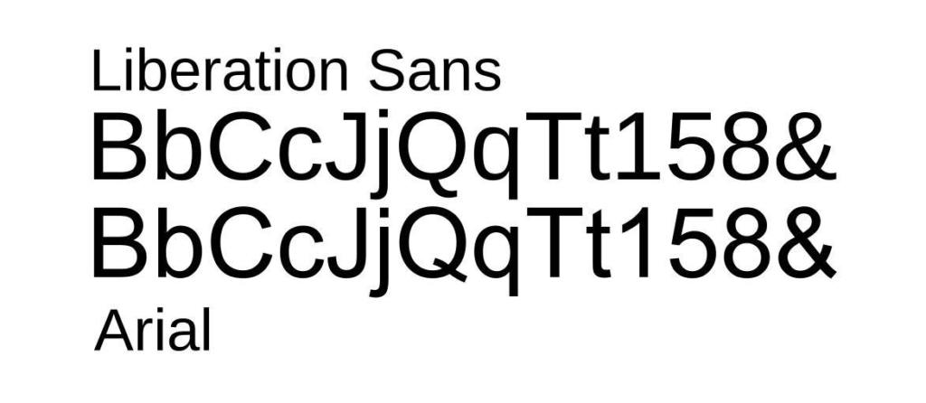
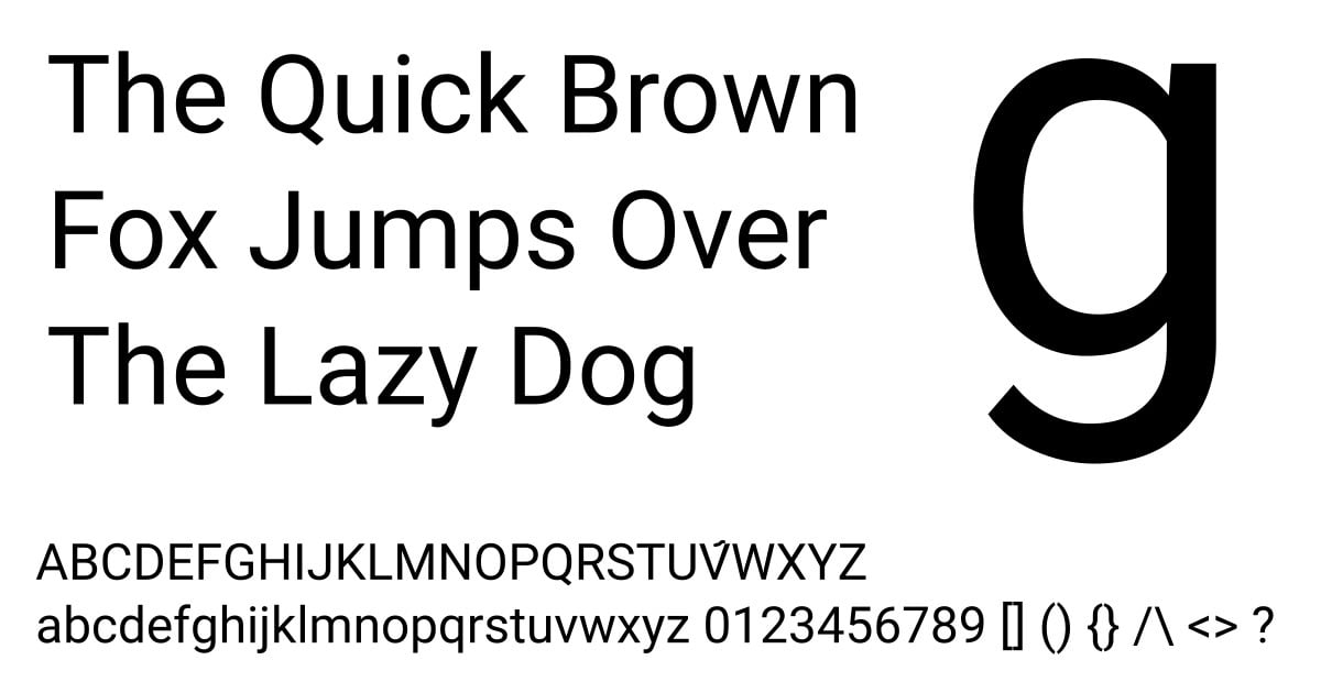
Fonts fall into “families” with minor variations but can create vastly different impressions. Serif and Sans Serif are highly recommended for resumes due to their readability. Serifs are characterized by small lines or tails at the end of strokes, while Sans Serifs (like Arial, Century Gothic, Helvetica, Geneva, MS Sans Serif, Tahoma, Trebuchet MS, Verdana) lack these decorative features.

Experts often cite these fonts as ideal for resumes:
- Arial: A classic and popular choice, known for its clean lines and readability, though it may seem too common for some.https://www.fonts.com/font/monotype/arial
- Calibri: A modern alternative to Times New Roman, it displays well on screens and is versatile in various formats. https://www.fonts.com/font/microsoft-corporation/calibri
- Cambria: A familiar choice with good on-screen readability, though less formal than other options.https://www.fonts.com/font/microsoft-corporation/cambria
- Garamond: Reflecting 16th-century design, suitable for academic or extensive work experience resumes. https://www.fonts.com/font/urw-type-foundry/garamond
- Helvetica: Recognized worldwide, particularly in branding, it offers a modern yet classic appearance .https://www.myfonts.com/fonts/linotype/helvetica/
- Didot: Ideal for creative fields like fashion or photography, it combines style with readability. https://www.fonts.com/font/canada-type/didot
- Georgia: A traditional alternative to Times New Roman, designed for clear digital readability. https://www.fonts.com/font/microsoft-corporation/georgia
- Book Antiqua: A Renaissance-inspired typeface, recommended for arts or humanities professionals.https://docs.microsoft.com/en-us/typography/font-list/book-antiqua
- Lato: Meaning “summer” in Polish, this font offers various styles, perfect for text and title differentiation. It’s open-source and free to download. https://fonts.google.com/specimen/Lato
- Roboto: Used in Google Maps, it’s less formal and suited for non-academic, less traditional environments. https://fonts.google.com/specimen/Roboto
Additional Resume Tips
When finalizing a resume, avoid mixing different fonts in one document. Use bold and italics sparingly for emphasis or section separation.
Resist the urge to include excessive content, which might lead to reduced font size and hinder readability. An ideal font size is around 11 points. Remember, the goal is to make the document easily readable for potential employers.