
Exploring Pantone Colors: The Creation of a Global Color Standard
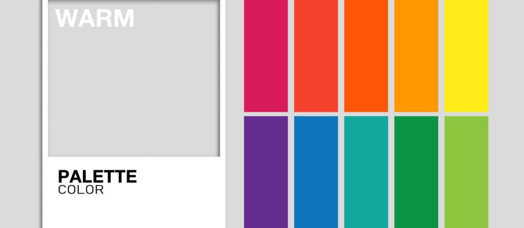
Human vision can differentiate approximately 150 distinct shades. As discussed in a previous blog entry, each shade can exhibit various attributes based on its luminosity and saturation, allowing us to perceive around 7.5 million colors. However, not every color has been assigned a name. For instance, the color we now recognize as orange lacked a designation until the early 16th century when Portuguese traders began importing oranges from India.
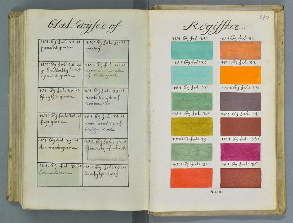
In 1692, an artist known only as A. Boogert compiled a manual on color application in painting, marking an early endeavor to classify and name colors. Boogert’s manuscript bears a striking resemblance to what we now know as the Pantone color guide.
Pantone’s guide comprises a series of colors, each identified by a unique code, launched in 1963 with the intention of establishing “a global color communication system that allows brands and manufacturers to make precise color choices throughout the production process.” This initiative aimed to mitigate the common issue of color perception discrepancies, which can cause a color perceived by one person in a particular setting to appear differently to another.
The foundational concept of Pantone colors emerged in the 1960s when Pantone, originally a New Jersey-based print company catering to the cosmetics, fashion, and medical sectors, sought to simplify color communication among designers, ad agencies, and printers. Lawrence Herbert, a chemist at Pantone, spearheaded this effort by purchasing the company in 1962 and introducing the first Pantone color guide a year later, featuring 10 colors and their specific ink formulations. Pantone quickly became a pivotal standard in the print industry, enabling professionals across various fields to consistently refer to the same hues, such as Google’s signature red, Pantone 7619 C.
Pantone’s offerings have expanded to include 1,867 unique colors for print graphics and 2,310 for fashion, home décor, and interiors. While not the sole color standardization system, Pantone is the most recognized, alongside others like the Munsell System and the RAL and HKS color systems from Germany.
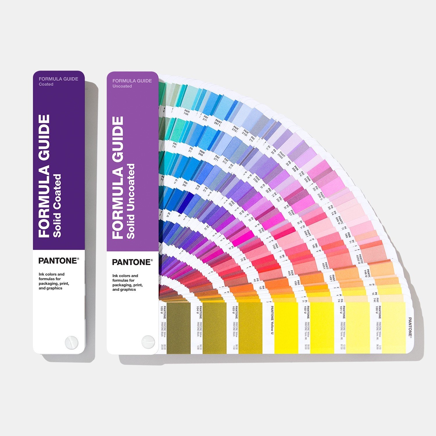
Pantone provides a variety of guides and tools on its website to aid in navigating its systems, with the Formula Guide being the primary resource for graphic and print professionals, supplemented by guides for metallic, pastel, and neon inks, as well as the CMYK and Bridgecollections for four-color matches.
Beyond traditional paper-based applications, Pantone has adapted its system for the fashion industry and product design, offering color samples on cotton for textile printing and Plastic Chips for product manufacturing, aligning with the Pantone Matching System.
Pantone’s influence extends beyond professional circles into popular culture through its Pantone Universe licensing program, with products ranging from mugs to smartphone covers and even a Pantone Hotel, showcasing the brand’s synonymous relationship with color.
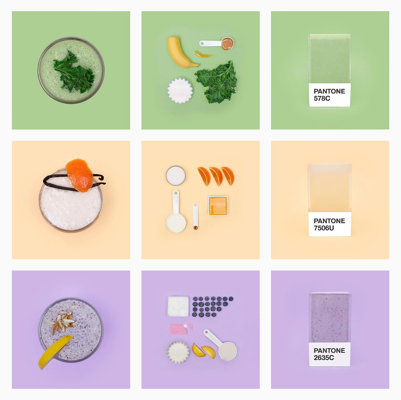
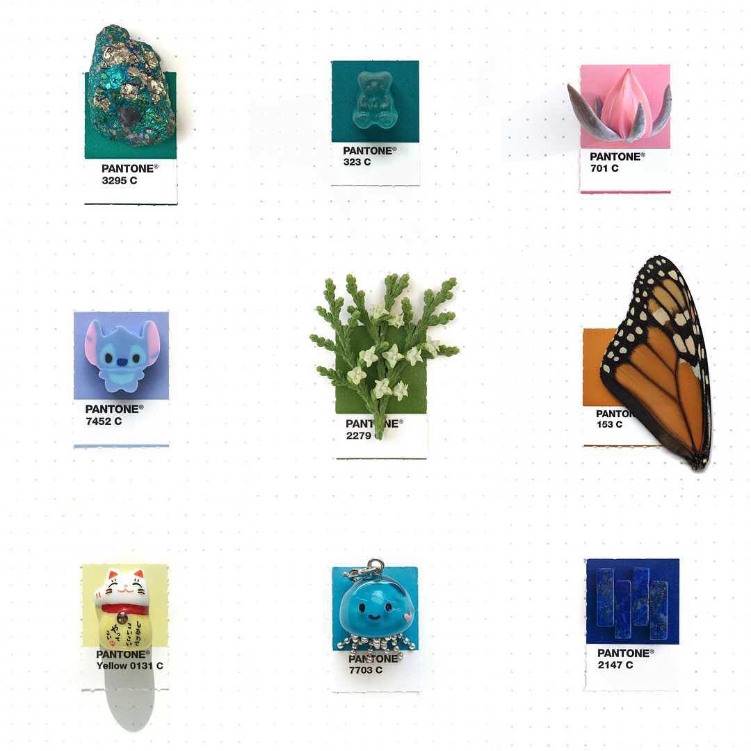
Pantone also engages in creative projects like the Instagram-based Pantone Smoothies and Tiny PMS Match, the latter matching everyday objects with Pantone colors, and has even inspired nursing scrubs in Japan and thematic hotels and cafes.
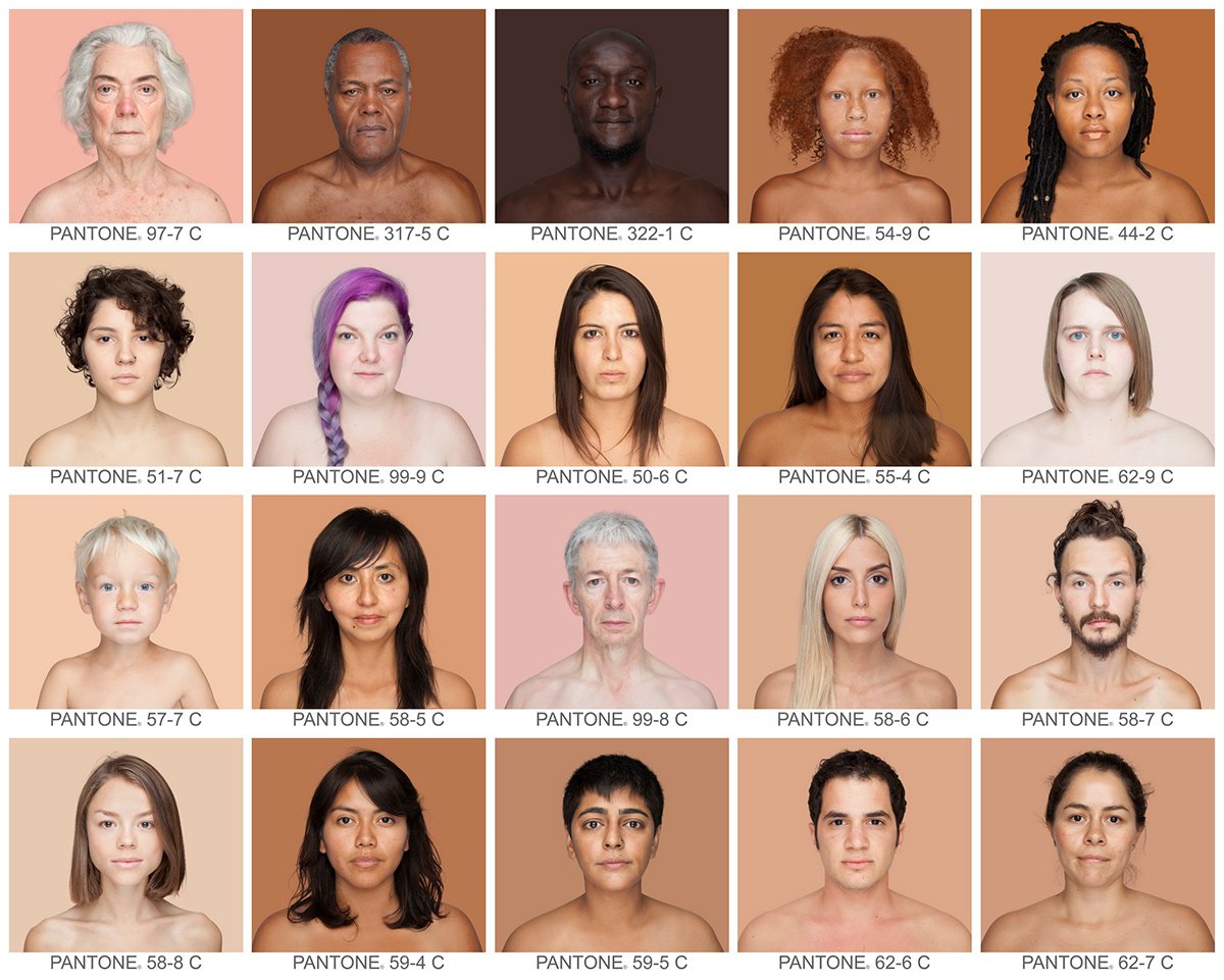
In recent initiatives, Pantone introduced the Skin Tone Guide in 2012 for photographic and cosmetic applications, participated in social campaigns like the Superbowl color commentary, and established the Pantone Color Institute in 1986 to advise on color strategy in branding.
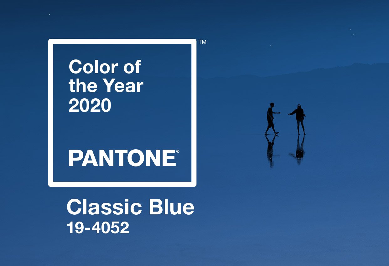
The annual announcement of the Color of the Year, a tradition since 2000, highlights Pantone’s ongoing influence in the design and marketing worlds, with PANTONE 19-4052 Classic Blue named the color for 2020, underscoring Pantone’s status as a global color authority.
[1] Bressan P., The Color of the Moon. How we see and why, Editori Laterza, Bari, 2007.
[2] From the Pantone website
[3] Budds D., How Pantone Became The Definitive Language Of Color, Fast Company, 2015
[4] On designer Adam Fuhrer’s website, a handy collection of all the colors of the year.