
How many versions of the Instagram emblem can you recall?
Consider it for a moment; it’s not too far back in time. We wager that the majority of you recall two distinct designs. But what if we informed you that the application actually boasts a trio of logos throughout its history? The initial logo, vastly different from the contemporary version, is often forgotten. Let’s take a moment to revisit the evolution of Instagram’s three logos, spanning from 2010 to today.
Who can recall Instagram’s inaugural logo?
Kevin Systrom, Instagram’s CEO and co-founder, was behind the design of the first-ever icon, drawing inspiration from the classic Polaroid camera.

https://en.wikipedia.org/wiki/Polaroid_Land_Camera_1000
The design featured a transparent background and incorporated intricate details directly mirroring those of the iconic Polaroid camera: the prominent flash, the rainbow stripe running across the camera’s center, three buttons, and the viewfinder. The design aimed for a three-dimensional, hyper-realistic look, notably including the shadow beneath the camera’s buttons—a level of detail unlikely to be considered for a modern icon.
The “iconic” logo
The second logo, which is probably more familiar to most, was created by designer and photographer Cole Rise in late 2010, taking inspiration from the 1950s Bell & Howell camera model.

It’s said that Cole Rise crafted the logo in merely 45 minutes, with only minor adjustments made afterwards to refine it. This redesign was unveiled six months later, in 2011. An interesting tidbit: did you know there’s also a less-known reverse side of the logo? Cole Rise designed it just for fun.

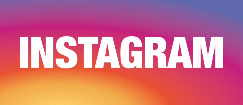
The 2016 minimalist logo
On May 11, 2016, five years after the previous update and following nine months of development, the company revealed its third logo.
This is how Instagram introduced the new design in a Medium post.

As often happens with major changes, the initial public reaction was mixed, with the redesign sparking both irony and criticism on social media.
Characteristics of the new logo
Questions arose about the whereabouts of the rainbow, a hallmark of the app, as well as the disappearance of the viewfinder and lens. However, a closer look reveals that these elements persist in the new design, albeit in an abstract form: the rainbow is represented in the icon’s tri-color gradient, while the viewfinder and lens are reduced to simple lines and dots. Although abstract, the logo continues to convey the essence of a camera, maintaining the brand’s legacy while projecting a forward-looking image. The sleek, minimalist design aligns with contemporary graphic design trends.

The redesigned logo is succinct, employs a flat design, and, crucially, remains visually appealing even at small sizes. The transition to a three-color blend—pink, purple, and yellow—introduces a more dynamic, vibrant, and warm effect than the use of solid, distinct colors. Only in hindsight can we appreciate the innovative nature of the gradient choice and the logo’s streamlined, simplified design.
The takeaway from Instagram’s logo evolution? True changes are initially challenging to grasp and accept: it often requires time to recognize their transformative impact. For brands, it demands boldness to deviate from the familiar to surprise and redefine expectations for a loyal audience. It’s all about having a clear, forward-thinking vision.