Launching a discussion on Paul Rand presents a unique challenge: where should one begin? A logical starting point might be a universally recognized company logo, such as IBM’s, highlighting Rand’s extensive partnership starting in 1956. This collaboration saw Rand develop an original logo, which, after several iterations, culminated in the iconic 8-bar design in 1972, a design that remains in use with slight modifications. During his tenure with IBM, Rand was responsible for creating a comprehensive brand manual and, in 1981, designing a poster that effectively became synonymous with the IBM brand itself, the Eye-Bee-M poster.

In 1956, at the age of 42, Rand embarked on a new chapter in his career focused on corporate identity design, shifting away from advertising. By this time, he had already made a significant impact with his 1947 publication, “Thoughts on Design,” a seminal work filled with insights on graphic design that remain relevant. In this book, Rand shares his perspective on the essence of graphic design, including the challenges faced by graphic designers, the importance of image representation, and the effective use of typography, particularly in advertising contexts. Michael Bierut, a partner at Pentagram, praises the book in his preface to the 2014 reprint, describing it as a quintessential guide to good design, emphasizing the irrelevance and utility of design work.

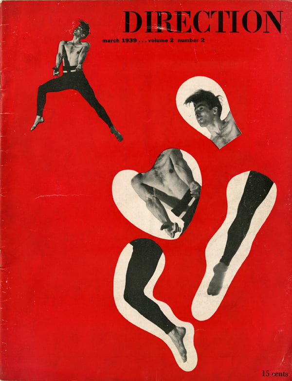
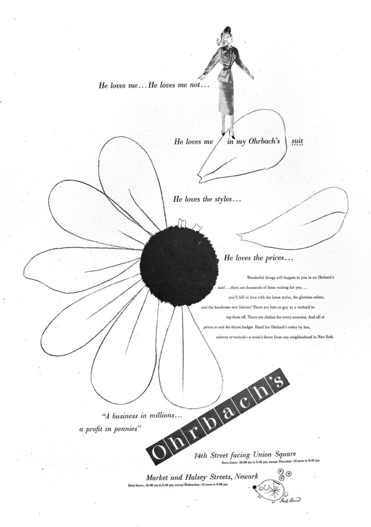
Rand’s pre-corporate era saw him contributing to various magazines and advertising ventures. Starting at 22, he began his foray into graphic design with work for “Esquire” magazine, soon taking on “Apparel Arts” and enjoying a collaborative relationship with “Direction” magazine, where he was afforded complete creative freedom. Self-taught, with a background that included an incomplete stint at Parsons School of Design, Rand was an early American adopter of European modernism in graphic design, bringing a blend of functional simplicity and abstract sophistication to his magazine and advertising layouts, deliberately steering clear of stereotypes.

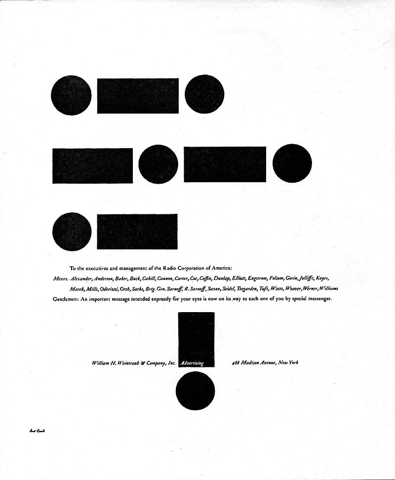
Transitioning to the advertising world at 27, Rand introduced a clarity and modernist aesthetic to the sector as the creative director at William H. Weintraub & Co., setting a precedent for visual communications that blend beauty with utility. His influence was so profound that seeking a “Paul Rand type” designer became common parlance in advertising circles, indicative of his unique approach to design that balances artistic purity with business acumen.

Rand’s pivot to corporate branding in 1954, marked by an award-winning campaign for RCA, led to the creation of enduring logos for major American corporations and institutions, including IBM, ABC, UPS, Yale University, and American Express. His work not only defined corporate identity but also left a lasting impact on the field of graphic design, as evidenced by his inclusion in a list of the 30 most influential designers in a special issue of Idea Magazine.

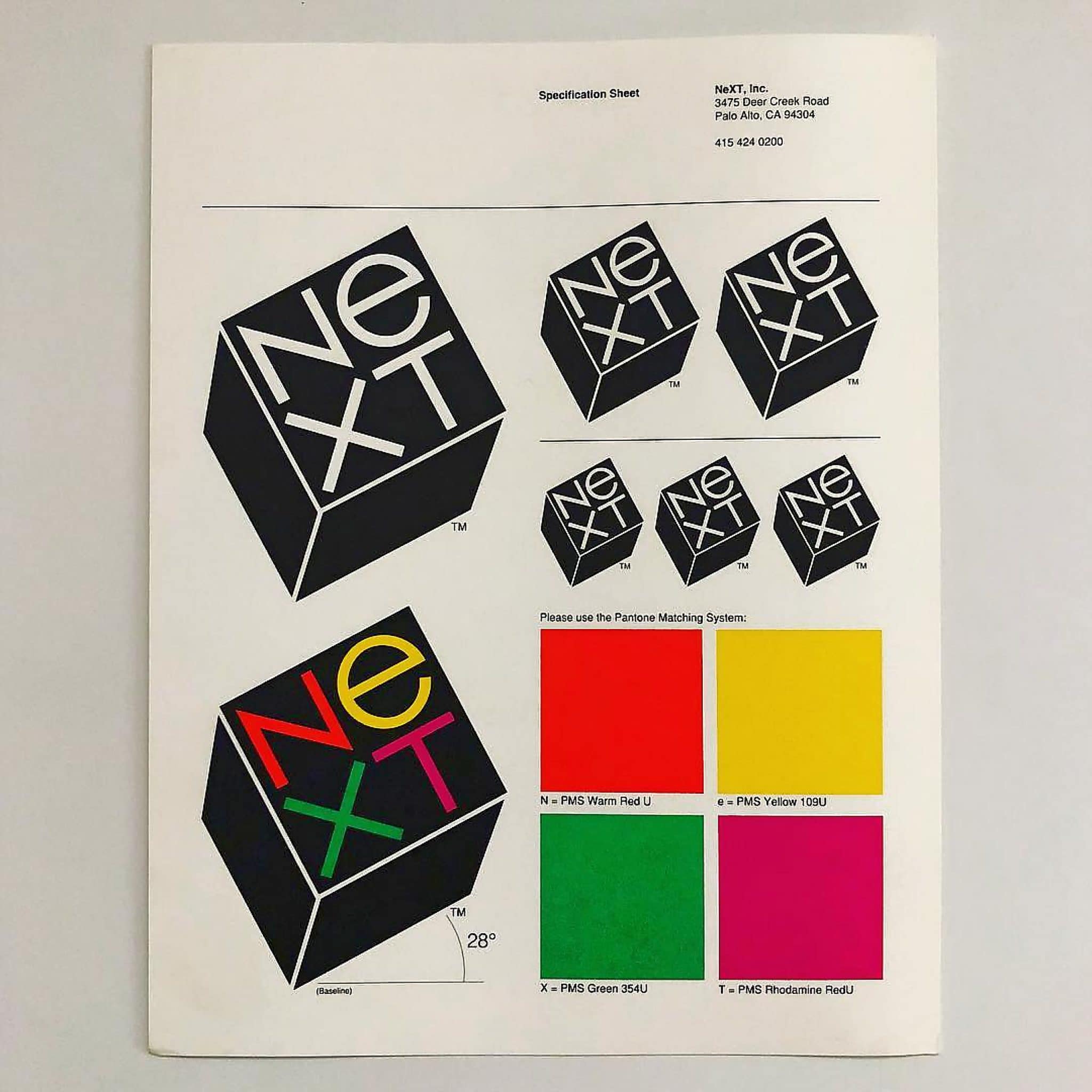
One of Rand’s notable late-career achievements was the branding for NeXT, a company founded by Steve Jobs after his departure from Apple. The collaboration between Rand and Jobs, marked by Rand’s direct and uncompromising approach to design, resulted in a distinctive brand identity that has outlived the company itself. Rand’s ability to communicate and elucidate the design process, as well as his emphasis on the presentation of his work, underscores his belief in the integral role of design in business and communication.

In sum, Paul Rand’s career spans over six decades, during which he significantly influenced the landscape of graphic design. From his early work in magazines and advertising to his pioneering contributions to corporate identity, Rand’s legacy is characterized by a commitment to functional beauty and a profound understanding of the role of design in shaping public perception and corporate identity.

