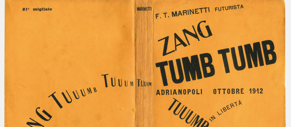
Futurism, born during a time of significant upheaval, aimed to revolutionize all forms of art to align with the impending technological and industrial advancements. It celebrated velocity, modern technology, youthfulness, and aggression, showcasing objects that symbolized these attributes like automobiles, airplanes, and the urban landscape. The movement sought to break away from historical traditions to embrace the vibrancy of the contemporary world.
The typographic innovation led by Filippo Tommaso Marinetti
Spanning from 1909 to 1944, the era commonly recognized as the Futurism period in Italy, saw a radical departure from traditional calligraphy, fonts, and typography, mirroring the movement’s ethos of discarding the past. This era witnessed a shift away from the long-established typographic and literary norms towards more expressive, less structured layouts that aimed to visually represent spoken and emotional expressions on paper.
The typographic transformation of Futurism kicked off in 1912 with Filippo Tommaso Marinetti’s creation of the first “words in freedom,” where words were devoid of any grammatical or syntactical connection and arranged freely without conforming to conventional sentence structures. This style was as much a visual revolution as it was phonetic, focusing on the auditory nature of words, often onomatopoeic, and their visual representation on the page, blending literature, music, and visual arts into a cohesive whole.

An instance of Marinetti’s innovative use of language is found in his work Zang Tumb Tumb (1914), which recounts the Battle of Tripoli. The title itself mimics the sounds of warfare – guns firing, shells exploding. The typography on the pages mirrors the visceral impact of the words, breaking free from traditional syntax and punctuation, allowing the letters to dynamically express themselves.

The Futurist Book
In his manifesto “Destruction of Syntax – Wireless Imagination,” Marinetti advocated for a typographical rebellion against the outdated and ornate concept of the book of verse. He envisioned the book as a reflection of futurist thought, free from the constraints of past aesthetics. This graphic revolution extended beyond the page to encompass the entire book, affecting its form, binding, and material, turning the book into a tangible object of art.

In 1927, Fortunato Depero, a futurist painter, sculptor, and designer, published Depero futurista, compiling his typographic experiments and other artworks into what he termed the first object-book. Bound by industrial bolts, Depero futurista stands as an evolution of Marinetti’s typographic innovations, marked by bold graphic designs and layouts.
The exploration of book form also delved into the use of materials, with metal emerging as a symbol of the Futurist ethos, inspired by the automobile and aviation. The “Lito-Latta” in Zinola became a hub for Futurist artistic collaboration, producing notable object-books lithographed on tin, such as Marinetti’s Parole in libertà futuriste-tattili-termiche-olfattive (1932) and Tullio d’Albisola’s L’anguria lirica (1934), both showcasing dynamic compositions that emphasized the physicality of the book.


Bruno Munari, whose later works in the 1960s and 1970s are well-remembered, began his design career during the Futurist era with innovative creations. His contribution to the “Bompiani Anti-Literary Almanac” in 1937 featured a satirical photographic montage, subtly critiquing Mussolini’s rhetoric by rendering his speeches comically bombastic through an inventive layout.
This exploration of Futurism’s typographic and book design legacy reveals a movement that not only challenged the visual and verbal norms of its time but also laid the groundwork for future artistic explorations in combining text, sound, and visual expression.


