Decades ago, a major Swedish furniture retailer introduced a catalog showcasing their products in lifestyle settings to help customers visualize the functionality and design possibilities of each item. Initially sold at newsstands, this catalog later became a complimentary gift, mailed directly to consumers, becoming a sought-after guide for home furnishing inspiration with affordable options.
The catalog distinguished itself by including product codes alongside item names, serving as a comprehensive tool for both sales and logistics personnel by listing essential product details like codes, photos, sizes, prices, and descriptions.
Although primarily a showcase of the company’s offerings rather than a corporate narrative, the catalog aimed to simplify the purchasing process for buyers and distributors alike, through its clear and organized presentation.
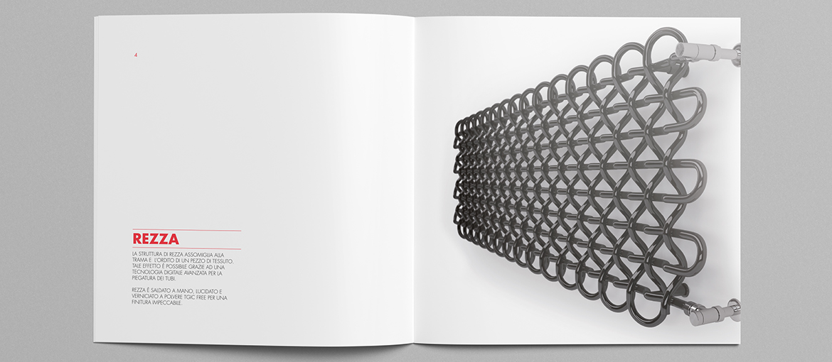
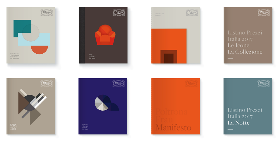
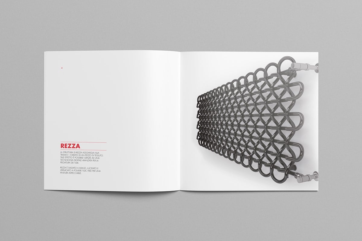
The structure of a catalog, resembling a book or magazine, varies in binding and size based on the number of products and the brand’s messaging desires. Design and layout choices reflect the company’s sector, with luxury brands often preferring compact, square formats, and design-centric firms experimenting with unique sizes and high-quality finishes.
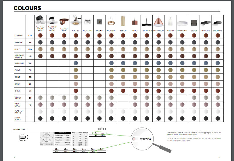
The catalog’s design should facilitate easy product reference and organization. Despite the traditional tabular layout, creative elements like color coding, dynamic grids, and section introductions can enhance its visual appeal without sacrificing functionality.
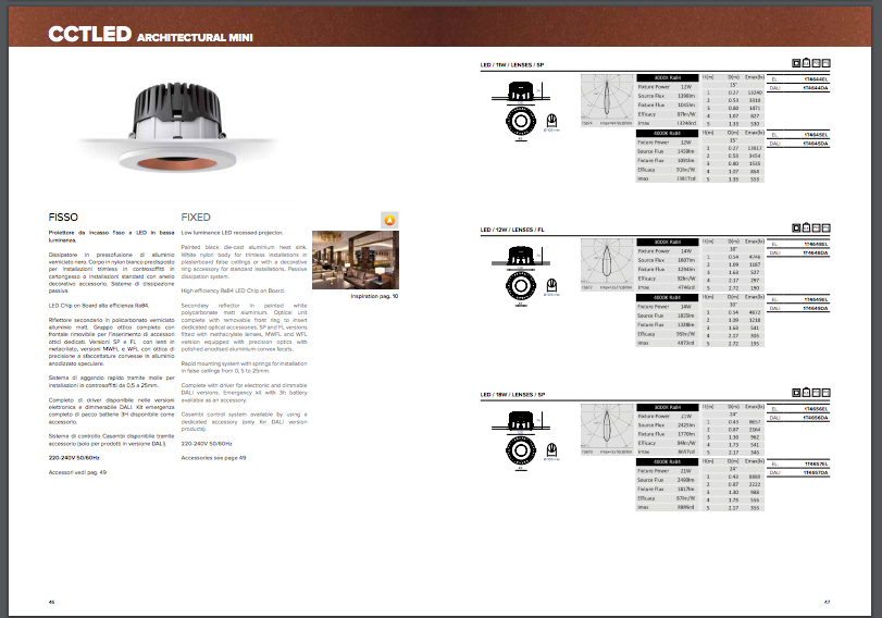
Photography plays a crucial role in catalog design, with consistency in style, lighting, and setting being paramount. Decisions on how to photograph products—whether in context or isolated—significantly affect the catalog’s storytelling and visual impact.


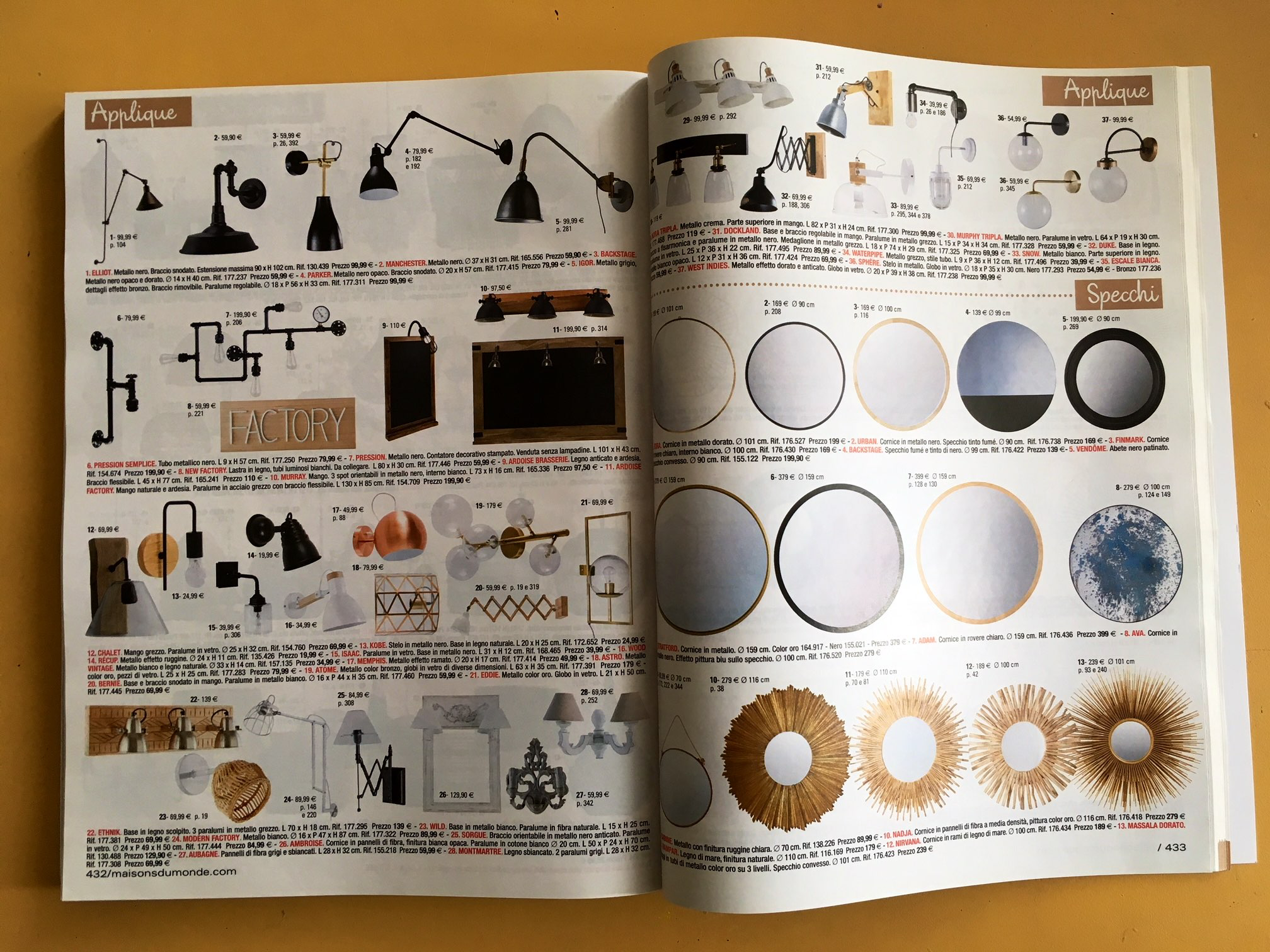 Maison du Monde catalog
Ultimately, a catalog is a vital tool reflecting a company’s identity and operational ethos, much more than just a sales or marketing asset. Its design and execution reveal much about the company’s organization and efficiency, underscoring the importance of thoughtful catalog production.

