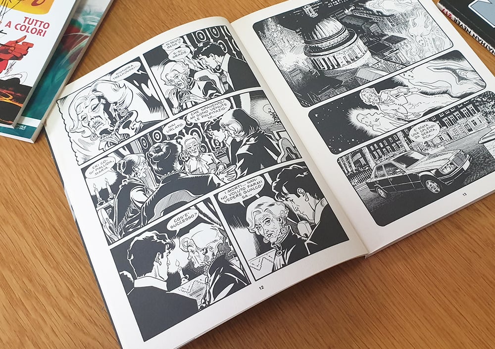
For many years, Italian newsstands have prominently featured comics in the distinct “bonellide” format, a term familiar within the industry that refers to a specific comic book format, characterized by its unique page size and material, emblematic of traditional Italian comics.
Iconic series like Tex, Dylan Dog, Nathan Never, and Martin Mystère, all published by the Milan-based Sergio Bonelli Editore, have captivated readers of all ages with their adventurous tales across genres such as western, horror, and science fiction.
Originally, the term “bonellid” was viewed somewhat negatively, but over time, it has come to neutrally describe this particular publishing format. This shift in perception was notably after the breakthrough success of Dylan Dog in 1986, prompting the emergence of several Italian publishing initiatives adopting this format, including Editoriale Aurea and Bugs Comics, with notable series such as Dago, Lazarus Ledd, Orfani, and the more recent Samuel Stern.

Many up-and-coming comic artists and illustrators now choose Pixartprinting for producing their works or assembling a captivating portfolio in the bonellide style. However, understanding the specific conventions of this format is crucial for optimal results.
Introducing Luca Lamberti: Your Guide to Mastering the Bonellide Format
So, how does one craft an Italian comic book in the bonellide style? What techniques and guidelines are essential for creating a portfolio that showcases the bonellide’s unique traits?
To delve deep into this topic, we consulted with Luca Lamberti, a renowned author and illustrator known for his work in the Italian market on titles like John Doe, and ongoing contributions to the weekly publications Skorpio and Lanciostory for Editoriale Aurea. Lamberti is also a creative force behind the Samuel Stern Series and co-editor and author with Leonardo Cantone of an upcoming Fantasy title for Bugs Comics, set to launch in 2022. His experience extends to the American market with IDW Publishing on Star Trek comics.
With Lamberti’s insights, we’ve prepared this guide on crafting comics in the bonellide format. This area is broad, requiring extensive study for many authors. Thus, this guide is an introduction for those aspiring to professionalize their passion or gain a deeper appreciation of the codes and craftsmanship behind Italy’s beloved comic tradition.

The Essence of Popular Italian Comics
As previously explored in our guide on creating French bande dessinée, comic page composition varies by region. Yet, some universal elements tie all comics together globally:
- The panel represents each drawn image.
- The cage comprises the collection of panels on a page.
- The gutter, or “white space,” delineates the narrative’s pacing.

Focusing on Italian comics, numerous creators have shaped and influenced this unique style. A foundational figure is Gian Luigi Bonelli’s Tex, with initial artwork by Aurelio Galleppini since 1948. Initially published in a strip format, Tex transitioned to the bonellide format post-1953.
Among contemporary talents, Lamberti highlights Massimo Carnevale for his distinctive elegance, Stefano Andreucci as the epitome of classic Bonellian artistry, and Corrado Mastantuono for his versatility across realistic and stylized drawing.
Characterizing the Bonellid Format
After familiarizing oneself with influential works and creators, it’s vital to grasp the format’s “rules.”
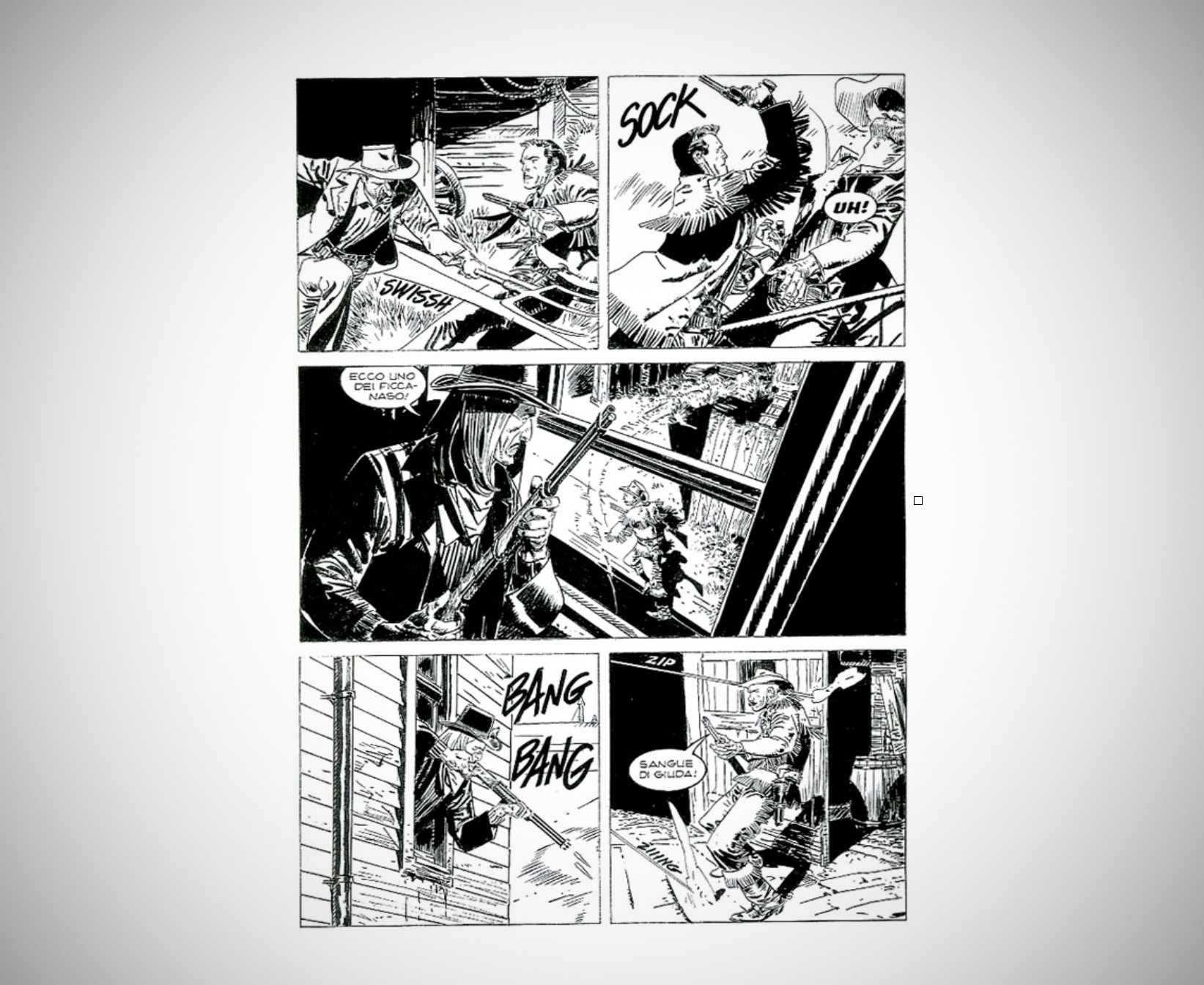
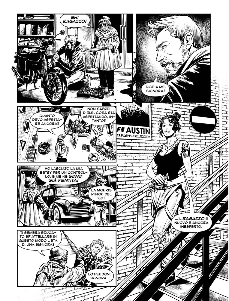
According to Lamberti, the “bonellide” format’s hallmark has been its structured narrative flow, appealing to a broad readership. Traditionally, Italian comic boards were methodically organized, rarely deviating from a structured layout, differing from the often more dynamic American comic boards. However, this format has evolved, adopting a freer storytelling approach, as seen with publishers like Bugs Comics.

The Bonellian Board: Layout and Final Product
The traditional Bonellian comic board is precisely defined:
- Measuring 16×21 cm, divided into three horizontal strips, potentially split vertically for up to six panels.
- A typical space of about 5mm separates each panel.
- Comic issues usually span 96 pages, with 94 dedicated to the story.
- Standard production is paperback, predominantly in black and white.

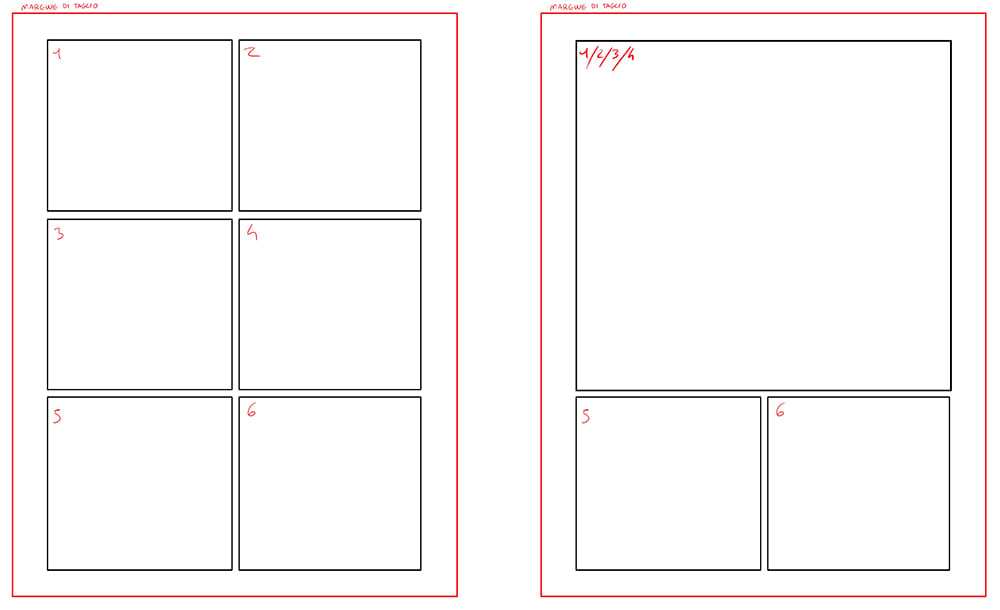
How is the layout of the comic page organized? Here, we provide examples to illustrate how panels are segmented on the page. Understanding these images involves recognizing certain elements:
- The edges of the panels are delineated by black squares or rectangles, collectively forming what is known as the cage.
- The space outlined by the black borders but within the red line is considered “outside the cage,” accommodating parts of the illustration that extend beyond the panel borders. This area traditionally offers limited space, though newer editions tend to allow for more expansive use.
- The red line marks where the page will be trimmed during the printing process.

Consequently, the final version of a comic in the bonellid format typically measures 16×21 cm, comes in paperback, and is predominantly black and white. Pixartprinting, for instance, provides options like unsewn and milled paperback binding for such projects.
This guide concludes our exploration of Italian comics, a realm rich with legendary creators, narratives, and series awaiting discovery.
