

The famous saying, “Even the eye wants its share,” rings true, especially when it comes to the relationship between a book and its cover. A book’s cover serves as the initial impression that captivates a reader even before they delve into its pages. Just as we dress appropriately for important events to make a good impression, it is equally essential to pay attention to the aesthetics of a book’s cover and layout, even in an era where self-publishing has become accessible to anyone.
In the past, people eager to share their memoirs with future generations relied on copy shops and mimeograph machines, resulting in paperback covers and stapled sheets for cost efficiency. However, today’s self-publishing landscape has evolved significantly, enabling individuals like your uncle to produce high-quality books at a lower cost. Therefore, if you have a completed manuscript, now is an ideal time to publish it affordably.
The book cover and layout are of paramount importance, even for self-publishers. The self-publishing industry is thriving, with numerous authors, approximately 30,000 in Italy alone, self-publishing books and ebooks each year. These authors cover a wide range of genres, from autobiographies and fantasy to illustrated children’s books, photo collections, cookbooks, and various manuals.
For publishers, the challenge lies in creating books that are perceived as high-quality, comparable to those found in traditional bookstores. Graphic decisions, such as the book cover design, layout quality, and printing, can make a significant difference in attracting readers and promoting noteworthy texts. A well-designed book cover, when executed correctly, is the most effective way to grab attention, increase visibility, and boost sales for your manuscript.
In this article, we will provide five concise tips to consider before publishing a book. These recommendations will help you select the right book cover image, choose suitable fonts, perfect the layout, and navigate the publishing process. These tips become crucial after you have completed the bulk of the work, ensuring that your manuscript is of high quality, free from errors in spelling, grammar, and syntax, and ready for publication.
We will cover the following aspects:
- Finding the ideal cover image
- Selecting the appropriate fonts for the cover
- Perfecting the layout
- The publishing process
The book’s cover, aesthetics, layout, and readability are often overlooked in the rush to publish quickly. However, they are integral components of producing and publishing a polished book. A visually appealing book with an attractive cover is more likely to attract potential readers. Let’s explore these essential aspects together.
Choosing the Right Book Cover Image
Renowned book cover designer Chip Kidd once said, “Covers are important because every book, beyond its shape or size, needs a face.” The book cover is the first impression that readers encounter, and it should captivate them positively. An inconsistent and poorly designed cover can diminish the appeal of the book, just as a weak title can do a disservice to your work.
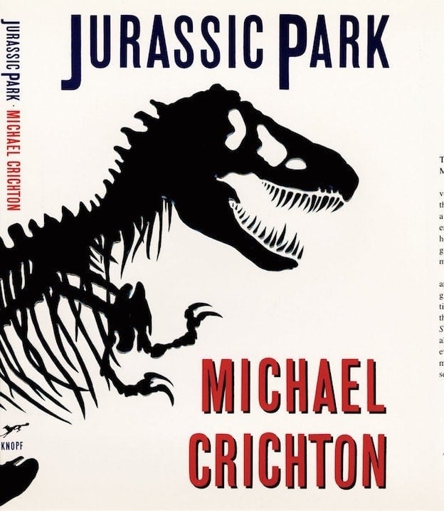
To create an effective book cover, begin by selecting a concept that represents the book’s content. Design the cover around this concept. For example, the iconic cover of “Jurassic Park” features a black, monstrous skeletal silhouette of a dinosaur, perfectly conveying the suspense within the novel. This cover has become a globally recognized trademark.
Once you have a clear concept, search for an image that aligns with it. You can use stock images (free or paid) or commission one from a professional designer or illustrator. When purchasing images, be sure to understand their usage rights, which may include limitations on circulation or the requirement to credit the author. Avoid potential copyright issues by clarifying usage rights before printing and distributing your book.
Consider collaborating with freelance illustrators or graphic designers if you lack design expertise. Explore platforms like Behance or Fiverr to find talented professionals who can bring your cover idea to life. The key is to choose an image that resonates with your concept and, in many cases, focus on a specific detail within the image for greater impact.
For inspiration, search online using keywords like “best book covers” to discover fantastic examples of book cover designs.
Selecting Fonts and Colors for the Cover
The choice of fonts is as critical as the image for a book cover’s success. The font used can convey a different message to readers, so it should align with the book’s tone and content. Design the cover with the visibility of a poster in mind, as it must be easily recognizable from a distance.
Consider the following tips:
- Maintain a single focal point, especially for fiction books that appeal to a broad audience.
- Choose fonts that complement the image and title, ensuring they do not distract from the overall design.
- For fiction or nonfiction, use classic fonts that suit the genre, differentiating between sans-serif, serif, and slab fonts as needed.
- Pay attention to color choices; different genres may have preferred color palettes (e.g., red, white, and black for essays; yellow, black, and red for fiction).
Drawing inspiration from established publishing houses and their design styles can provide valuable insights. Each publisher has its own unique approach to cover design, fonts, and overall aesthetics.
Perfecting the Page Layout
Beyond the book cover, an essential aspect of book design is the interior page layout. A well-executed layout ensures a smooth and enjoyable reading experience, enhancing the book’s credibility. Just as a visually appealing cover attracts readers, a well-structured layout keeps them engaged.
Consider the following elements when designing the page layout:
- Margins: Ensure proper spacing between text and page trim, both on the outer edges and inner margins near the binding. Adequate margins prevent text from being lost in the fold.
- Headers and page numbers: These aid reader navigation. They should be informative without being intrusive and vary based on the book’s genre and style.
- Initial pages: Follow typographical conventions for frontispieces, title pages, colophons, and other introductory pages. These elements introduce readers to the content progressively.
- Orphans, widows, rightness, and justification: Check for isolated words at the start of pages, excessively short lines, and spacing issues caused by incorrect formatting. These details significantly impact the reading experience.

In conclusion, while it may be tempting to rush the publication process, taking the time to carefully select a compelling cover image, choose appropriate fonts and colors, and perfect the interior layout will elevate the overall quality of your book. Remember that a book that not only looks good but also offers an attractive cover and well-structured pages is more likely to capture the attention of potential readers and stand out in the competitive market.